
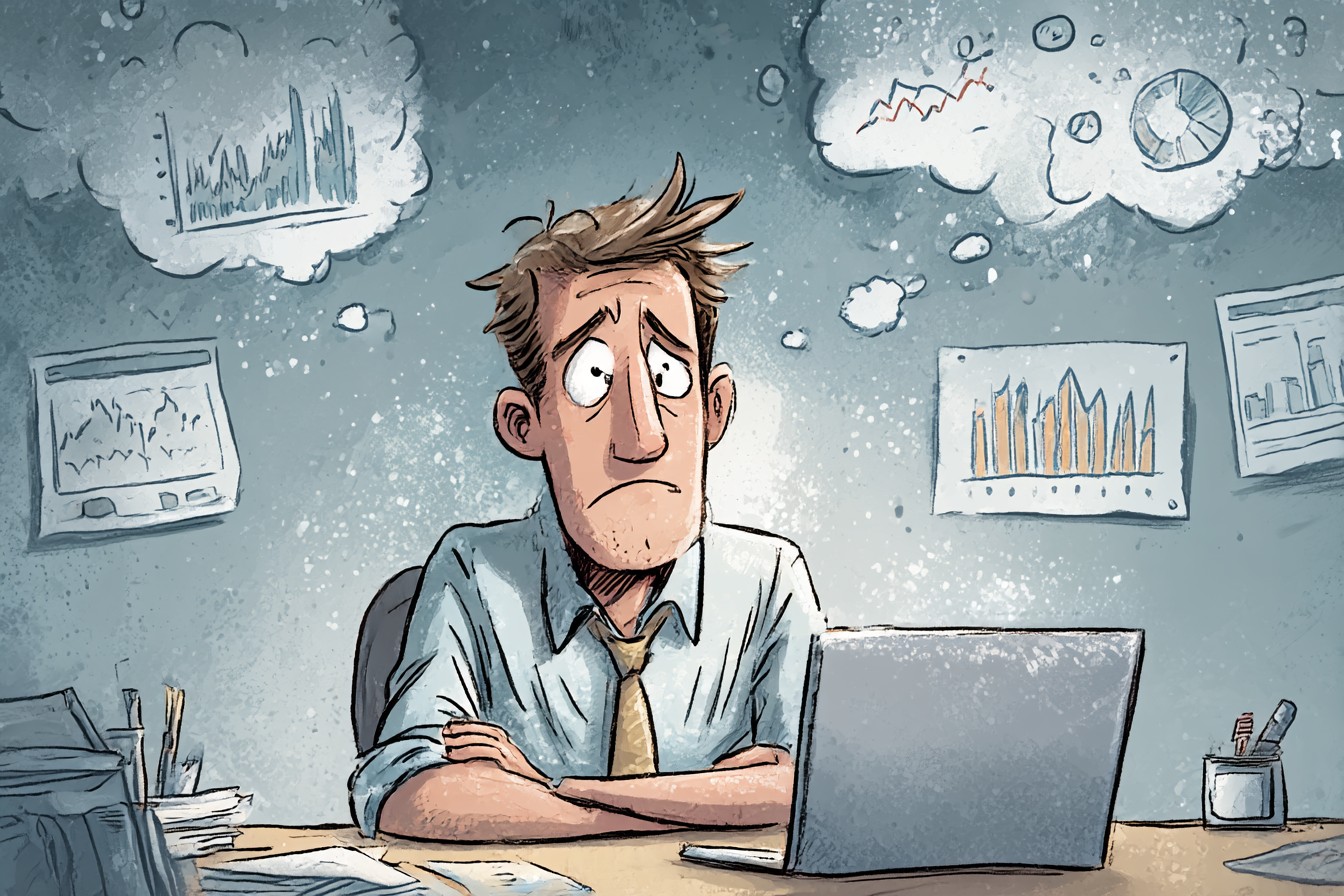
It began innocently enough. A simple spreadsheet logging how much coffee I drank each day. Date, amount drunk, simple happiness index.
There was nothing unusual about tracking information on my day-to-day habits.

Except I’m not normal and what started as data tracking turned into something my girlfriend Mei likes to call “your unhealthy obsession with numbers.”
Okay, so let’s back up. I’m a biochemist.
Deal with it. I love data. I’m used to reading screens and blinking cursors for hours at a time, coaxing secrets from the microbial world.
What I wasn’t used to was measuring myself. Taking something as simple as number of hours slept and turning it into something quantifiable. Mine.
The first time I messed up….Oh, I saw it immediately. Three months into logging my coffee consumption, I spotted it. Seven cups.
Seven cups of coffee on a day where I normally only had three or four. I double checked my entry. Seven.
“That’s not right,” I muttered, staring at the offending blip on my quickly sketched graph. Immediately, I felt defensive. Not confused, but downright offended by this aberration in my data.
Like it knew I was looking at it, peered up at me from the screen with its little LED eye and said “Ha! Take that, coffee monster!”
Forty minutes of cross-checking calendar entries and text messages later, I remembered it had been Josh’s house that weekend and he’d brought over that new Ethiopian Yirgacheffe we’d been wanting to try. Suddenly everything made sense.
Happy faced number confused me because IT WAS RIGHT. It was an outlier, sure, but a completely explainable outlier. Except…I began to think of that outlier as deliberately misleading.

Incident number one. Of many. Pretty soon I was tracking everything.
Hours slept. Steps walked. Hours worked.
Inches shed. Inches gained. There was even a period where I assigned emotions to how hot or cold my showers were using a scale I created I called the “Maxwell Morale Shower Index.” The MMRI lives on my bathroom wall to this day, complete with glossy laminated card containing all values 1-10.
Passions run strong with my houseguests over whether the MMRI is ingenious or completely mad. You can guess which camp I fall in. Graphs multiplied.
Categories branched. Soon my desktops were adorned with colorful pie charts and handy-dandy tables that would make Wall Street traders blush. But you know what else happened?
I started assigning personalities to my datapoints. Okay, they don’t have NAMES. But…
I started grouping them by type.
Sturdy believers who lined up perfectly every. Single. Time.
Quitters who would start strong but fell off at the first sign of resistance. A few free spirits who generally fell in line…but every once in a while would surprise you by choosing excitement over safety. And the Outliers.
GOD those Outliers thought they were sooo cool. “How many goddamn spreadsheet characters do you have?” Mei laughed one night as I sat on the floor of our apartment coloring coordinate points based on what had, at that point, become known as their “aura.”
“I have six auric spreadsheets I’m working on,” I deadpanned, swiveling away from my laptop so she couldn’t see me vehemently denying the urge to write PROPHECY INSIGNIFICANT within my weekly happiness chart. “I am deeply researching biorhythms.”
“You just told me your bullshit spreadsheet hobby is analyzing whether certain days of the week MEAN anything.”
“Shh you’re dismissing science.”
She won that argument.
Things went from bad to Alec-Baldwin-in-Dawson’s-Creek when I decided to start tracking my mood. At first it was simple, a 1-10 scale, measured thrice daily. But of course it didn’t take long for me, the man who gets PhDs for a hobby, to decide that was too crude of a measurement tool.
Suddenly my mood was being assessed on 27 different variables ranging from mental clarity to a made-up metric I decided to call “joyfulness.” All of which produced graphs. All of which produced trends. All of which….produced personalities.
My worry scores were drama queens. My motivation scores were snails. Slow to wake up and infuriatingly consistent in their refusal to budge.
But boy did my sleep scores love to make up for lost time. Let me explain. One morning in month eight of my personal metamuseumics project (yep that happened), I woke up feeling fantastic.
But according to everything else? I should’ve been waking up feeling like death. Like weeks before, I leaned over my breakfast tray and started clicking through my spreadsheets.
Hours slept seemed fine. But bathroom breaks? Hell if I knew.
Coworkers? Same number as the day before. “Whoa whoa whoa…” I muttered, massaging my temples and trying to wrack my brain for anything that could explain such dramatic discrepancies between how I felt AND WHAT THE DATA WAS TRYING TO TELL ME.
And then it hit me. The datapoints were sabotaging each other. Can you believe that?
They teamacked up. Numbers, man. I should’ve known.
Hours slept was clearly TEXTING bedtime to skip workout THAT I NEVER DID ANYWAY to throw me off. Sure, morning bathroom breaks had gone up, but caffeine intake had INCREASED by a CORRELATION COEFFICIENT of 0.94876. Case closed.
It took me three days to map out all of the “friendships” my datapoints were crafting using stray colored string and thumbtacks in my apartment. Josh had stopped by earlier that week to borrow my centrifuge (what happens in labeneighbours stays in labeneighbours), and apparently stopped short in our hallway to compose himself. “Mate,” he had whispered, eyes wide as he stared at my wall.
“This is borderline Jon Batesy.”
“I know right? Guys, look at how Thursday sleep durations are totally consorting with Monday overnight cappuccino amounts to make my wake up times feel like crap!”
He shuffled backward toward the door. “Remember when you used to blow stuff up for fun like a normal scientist?”
Yeah.
None of my friends stay indoors for my birthday parties these days. Long story short, I began to see communities in my data. Tribes ofnumbers representing every facet of me slowly separating into distinct data_groups.
Or DATA FAMILIES. With THEIR OWN DYNAMICICS. You crossed the point of no return when you started running regressions on your data and realized that certain numbers were consistently, stubbornly opposed to everything you thought you knew about yourself.
My overall happiness scores were feeding me bullshit. They became like those fucking Fu Manchu mustaches from Steve Burns’ house on That’s So Sillicon Valley. They just hung there annoying as hell telling me everything was sunshine and rainbows when I knew deep down…..
Datapoints were liiiiies. Months passed. Categories multiplied.
And all of my datapoints began to develop….SOUPLES. Okay, they don’t have NAMES. But I yell at them.
See, once I realized my data wasn’t just telling a story, but arguing, defending, and heck yes TELLING ME WHAT TO DO…I started assigning “personalities” to my trendlines. My Wednesday running distances had always been a bit suspect if you ask me. Suspicious little bastards.
Last winter I was logging my seasonal mood swings when I noticed something… OFF. Winter numbers were huddling together for warmth. Summer numbers were sprawling out like manual thermometers.
Spring numbers were…..CHIPPER. My spring numbers threw touchdowns every single year. So, obviously what I needed was a way to quantify these “emotional clustering tendencies” my numbers kept demonstrating each season.
Three days and probably enough loving poured into a crudely coded algorithm to open its own eyes, and I had my answer. Or so I thought. As soon as I hit RUN, I got an error message I’ll never forget.
“Calculation Failed: Insufficient sentiment to perform numeric calculations”
My computer had just told me my numbers were hurting its feelings. Which, yeah. That was the day I knew I needed help.
Or at least some serious insight. “Mei,” I sighed that night as I slowly trudged upstairs, glaring down at my scatterplots. “I think…I think I may have an unhealthy relationship with my datapoints.”
She looked up from the particle entanglement journal she was reading suspiciously.
“No…. The man who named his sleep data ‘the dorm’ and refers to his statistical anomalies as ‘misbehaving motherfuckers? !’ That man doesn’t think he might have an issue with numbers.”
“Yo are totally being ironic right?” I squeaked.
No she wasn’t. Trust me on this one. You see, while my relationship with my spreadsheet entries may have reached unhealthy levels, I had unwittingly stumbled upon a breakthrough in data visualization.
Up until this point the human race had been bored by statistics. But what if THAT was the problem? What if we just needed to approach the info dressed in slightly nicer clothing?
I decided to test my theory. I logged off of everything. Deleted my health tracking mobile apps.
Hid my FitBit. And for two weeks I stopped tracking. Every.
Single. Thing. It was the hardest thing I’d ever done.
For a week I found myself itching to reach for phantom rings on my fingers, secretly judging my eating choices based on neverending SyLES that wouldn’t stop shouting in my head. I was dataless and it was agonizing. But slowly…I started living again.
Once I stopped worrying about the numbers my body was collecting, I began to actually EXPERIENCE them. I drank coffee and enjoyed it instead of noting where it fell on my caffeination index. I slept and only worried about how I felt WHEN I woke up, not how long I slept for.
Two weeks became three. Then four. I finally broke yesterday.
And logged back into all my accounts. …and you know what? The numbers still had patterns.
Trends. They still FIT ON REGRESSION LINES FOR CHRIST SAKE.
But they weren’t friends.
They weren’t enemies. They were just numbers. Mostly.
Honestly Wednesday running distances are up to something. We always suspected they were amateurs.
0 Comments